Beredskapslyftet
Client:
Beredskapslyftet
Studio:
Accenture Song Nordics
Country:
Norway / Sweden
Visual Identity
Art Direction
UI/UX
Illustration
Beredskapslyftet creates meaningful impact in societies by activating businesses in challenging times.
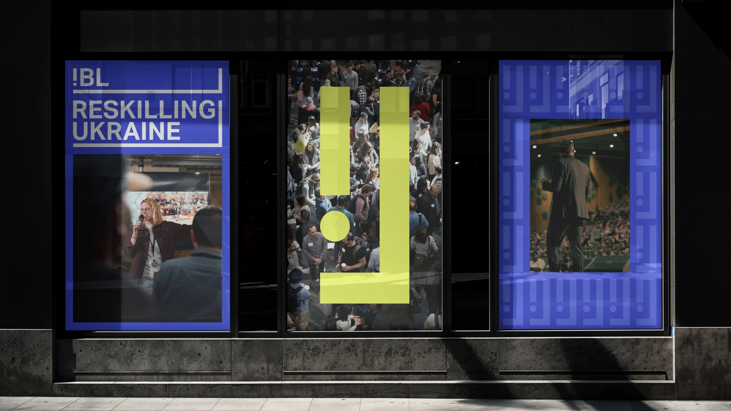
The brand is a rallying call—a beacon of urgency, resilience, and action, inspiring our partners to respond swiftly, think boldly, and engage with purpose.
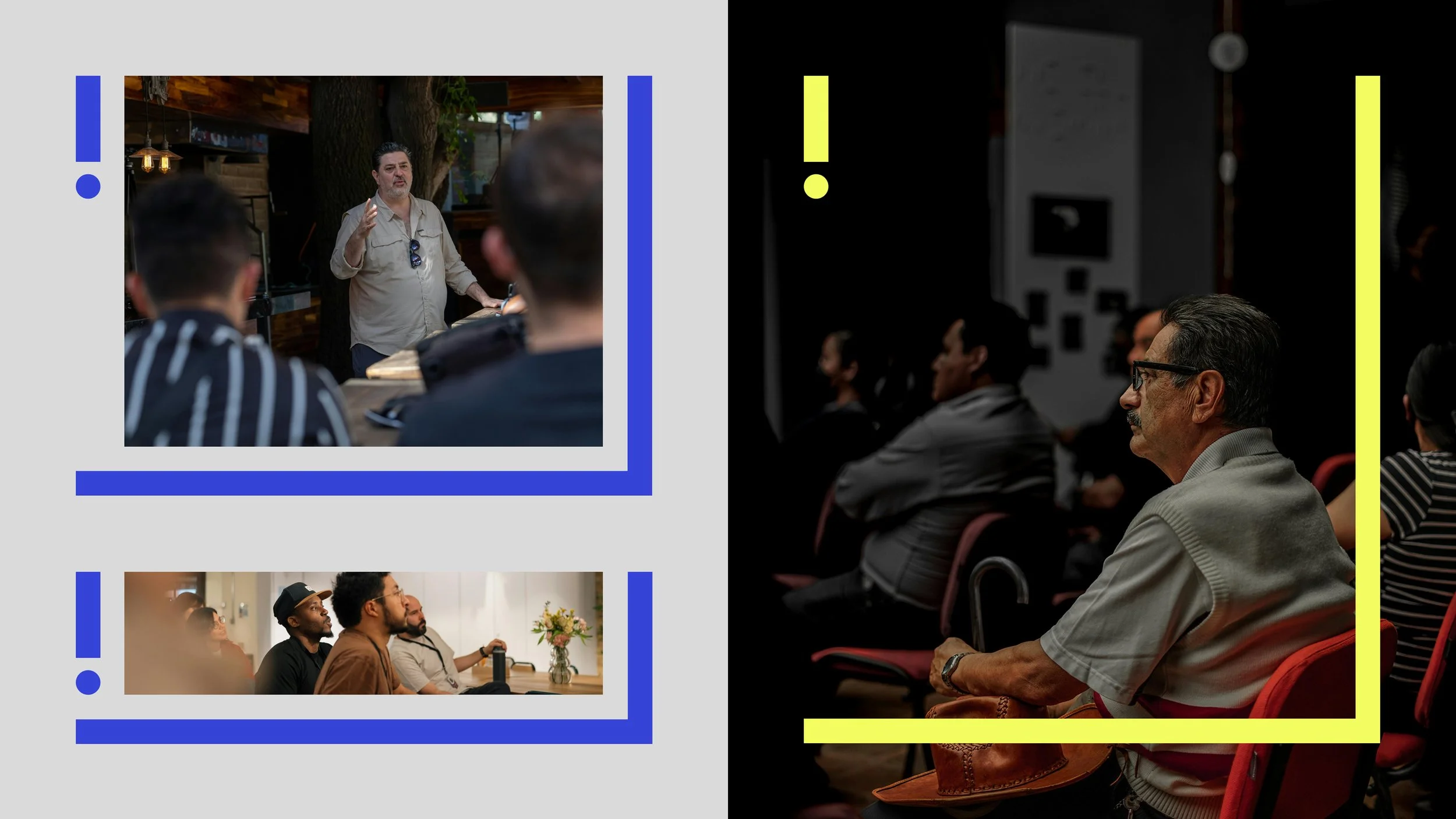
The ! represents the "B" in the initials BL, and a striking symbol of immediate action—serves as a focal point, communicating commitment to swift response in times of need.
The L introduces an innovative, adaptable quality, symbolising flexibility and readiness to pivot in response to diverse challenges. It also conveys a sense of movement and progression, echoing a capacity for transformative action.

