Coop Denmark Brand Refresh
Coop's growing portfolio of sub-brands had created a fragmented brand landscape, with multiple identities competing for recognition. The challenge was to unify the portfolio while retaining the equity and individuality of each brand.
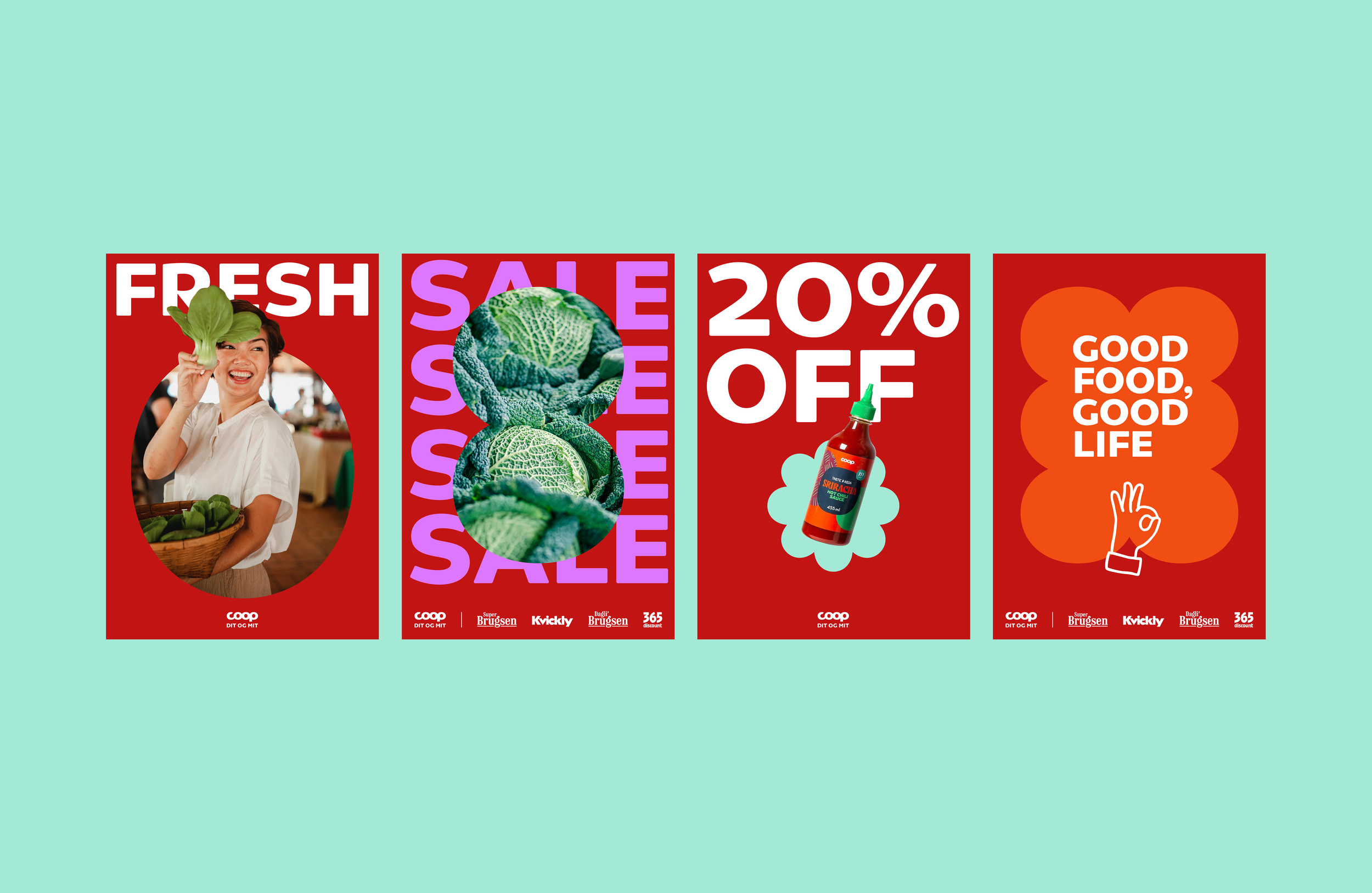
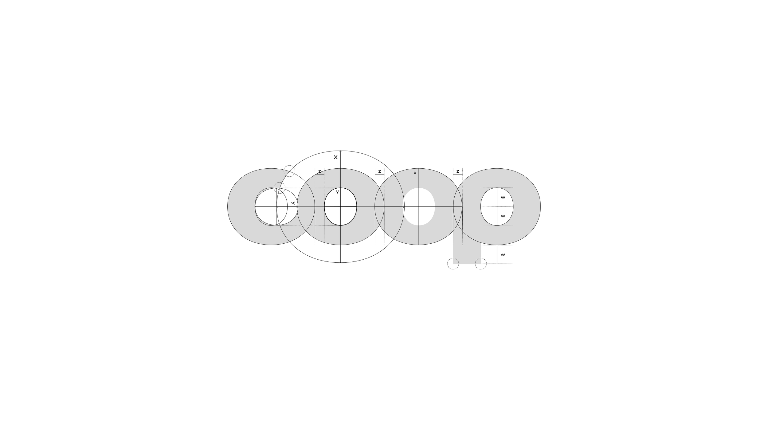
The logo was redesigned using the new Coop typeface, evolving the original mark into a form that is optimised for digital environments while staying true to Coop's founding idea of community. The iconic "O" became the basis of a wider visual language, transformed into graphic patterns that represent people and communities coming together. These patterns are also inspired by forms found in everyday groceries, from eggs in a carton to the internal structure of a tomato. This creates a subtle link between the identity and the products at the heart of the Coop experience. A distinctive colour palette helps differentiate Coop from competitors while bringing greater cohesion across the brand family.
The result is a modern identity system that unifies Coop's diverse portfolio, strengthens recognition, and honours the cooperative spirit that has defined the brand from the beginning.
Crafted at: Accenture Song
Creative Director: Mads Tagel
Brand Strategist: Anders Jensen
Designer: Angela Soh